
Problem
Although we had proven the need and use of Troca+ we found issues to be solved in its usability, clarity of information and delivery of value to the user that hurt the project's metrics. In addition, we still had a large percentage of vendors who had not signed up for the program.
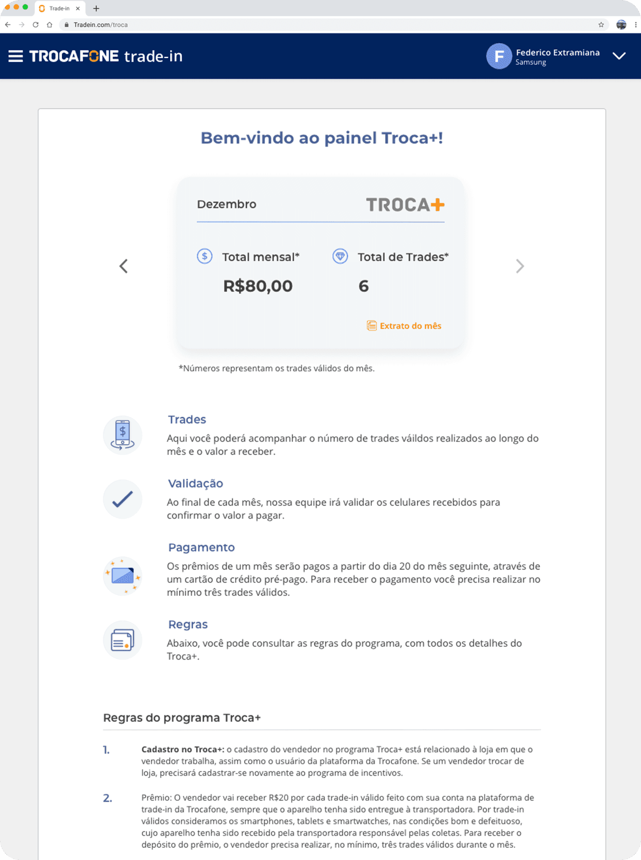
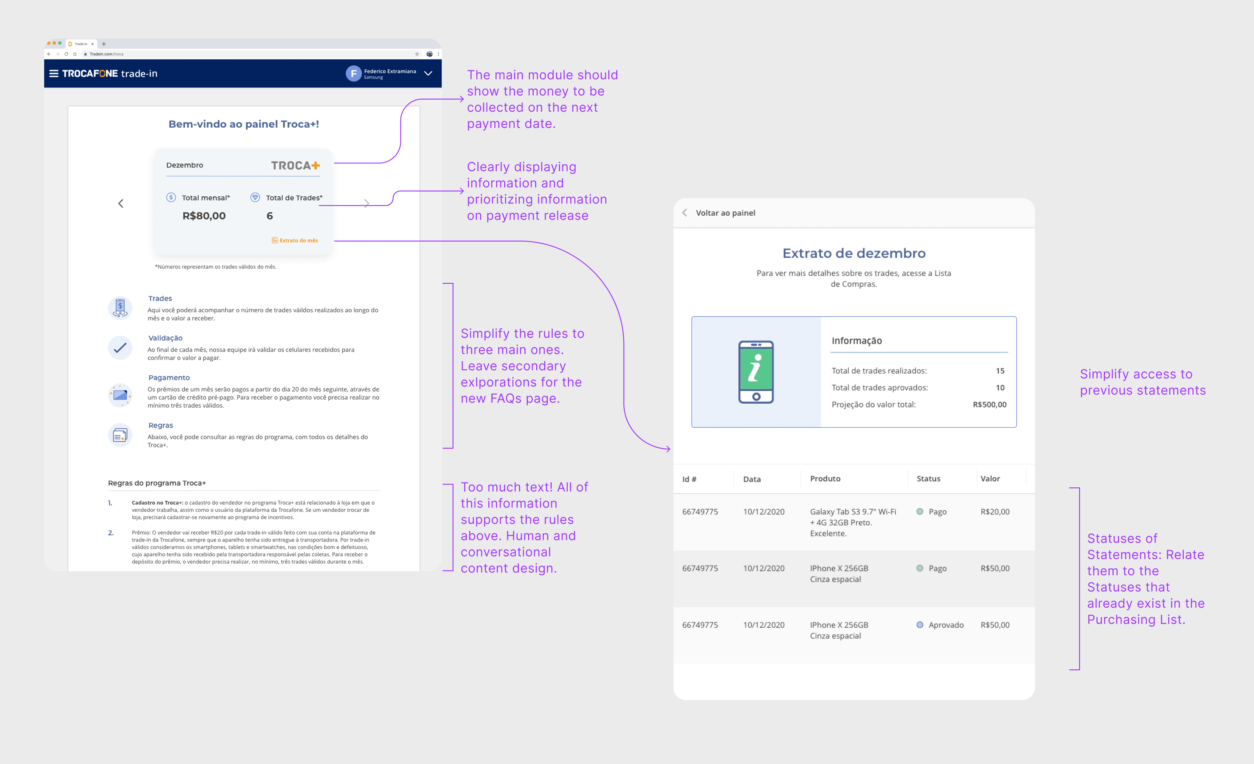
2019: Original Troca+ design
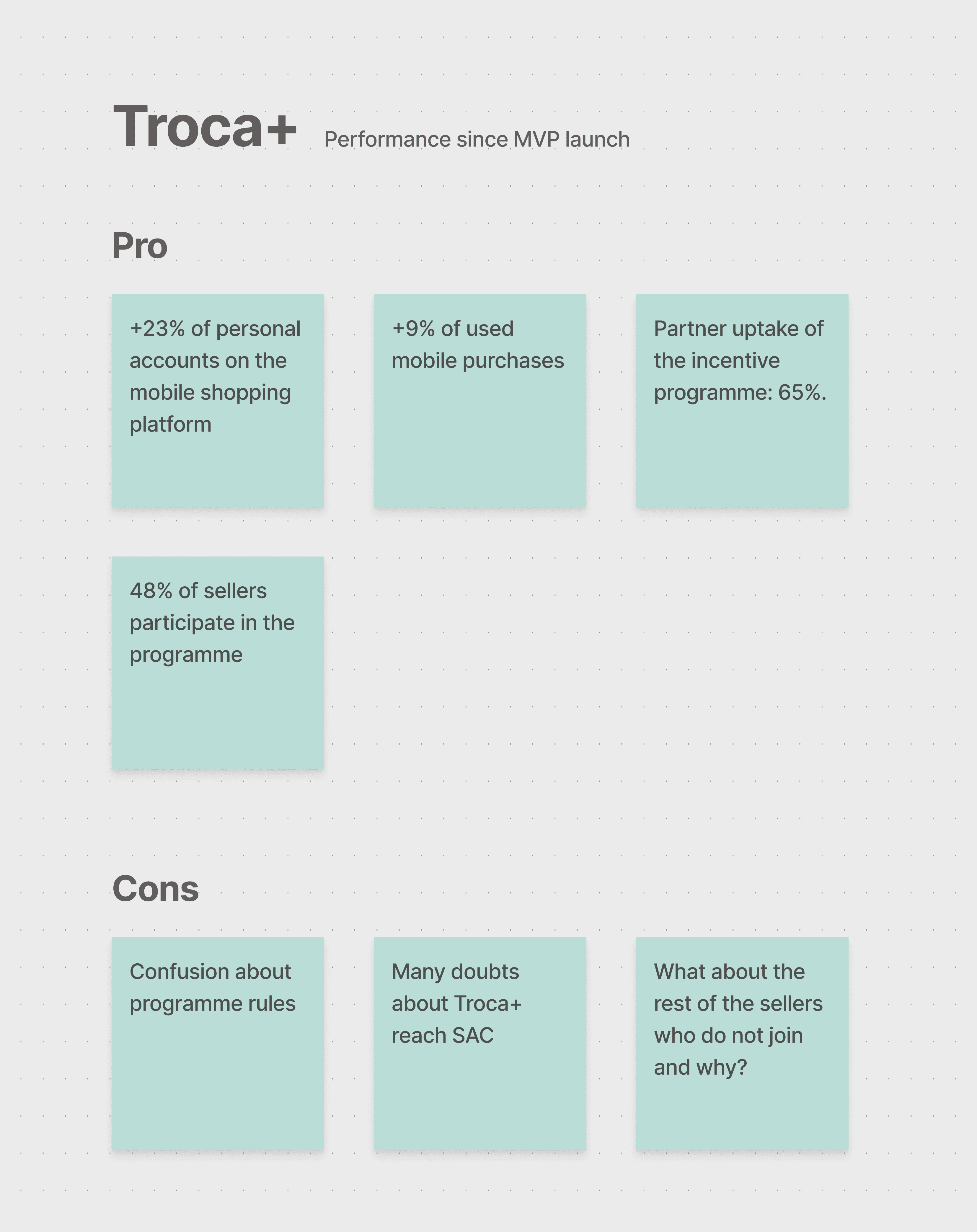
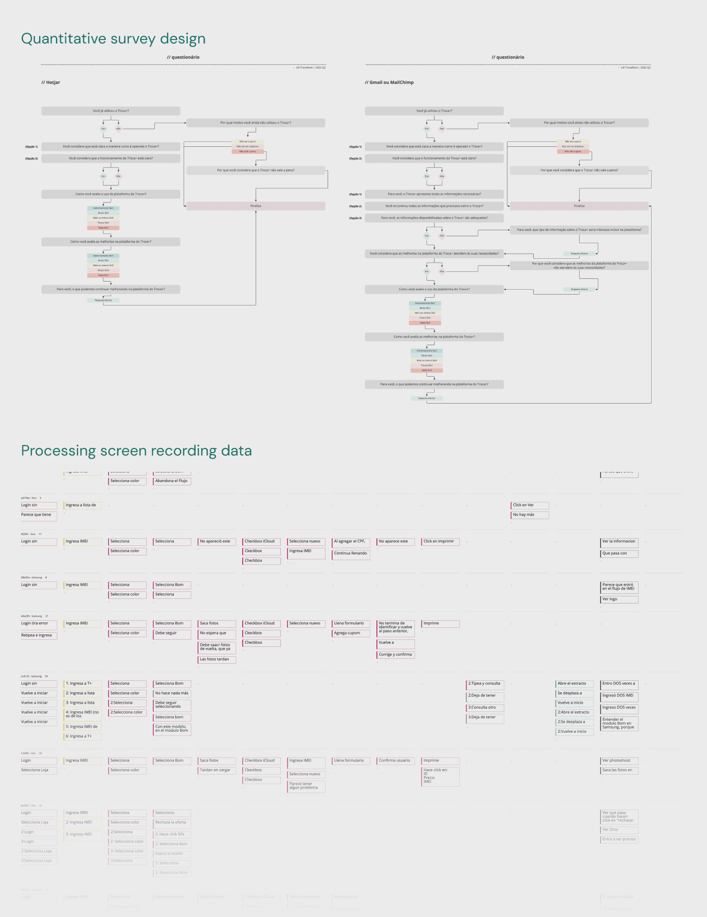
To improve the program experience, we conducted a variety of research such as qualitative interviews, quantitative surveys, and screen recordings.
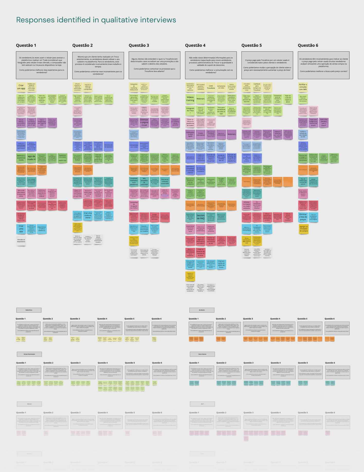
What users are saying:
Troca+ promotes sales and acts as an incentive.
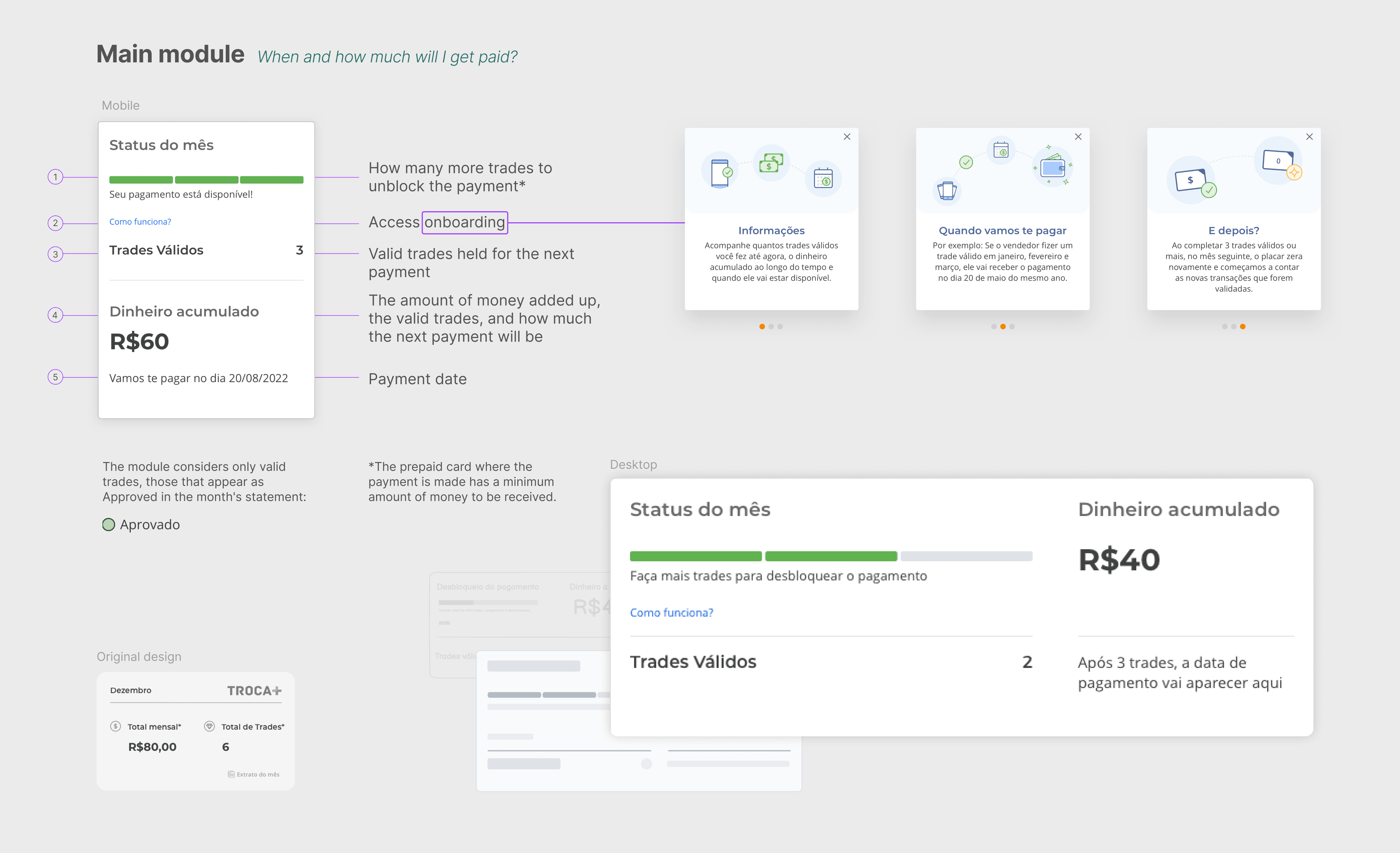
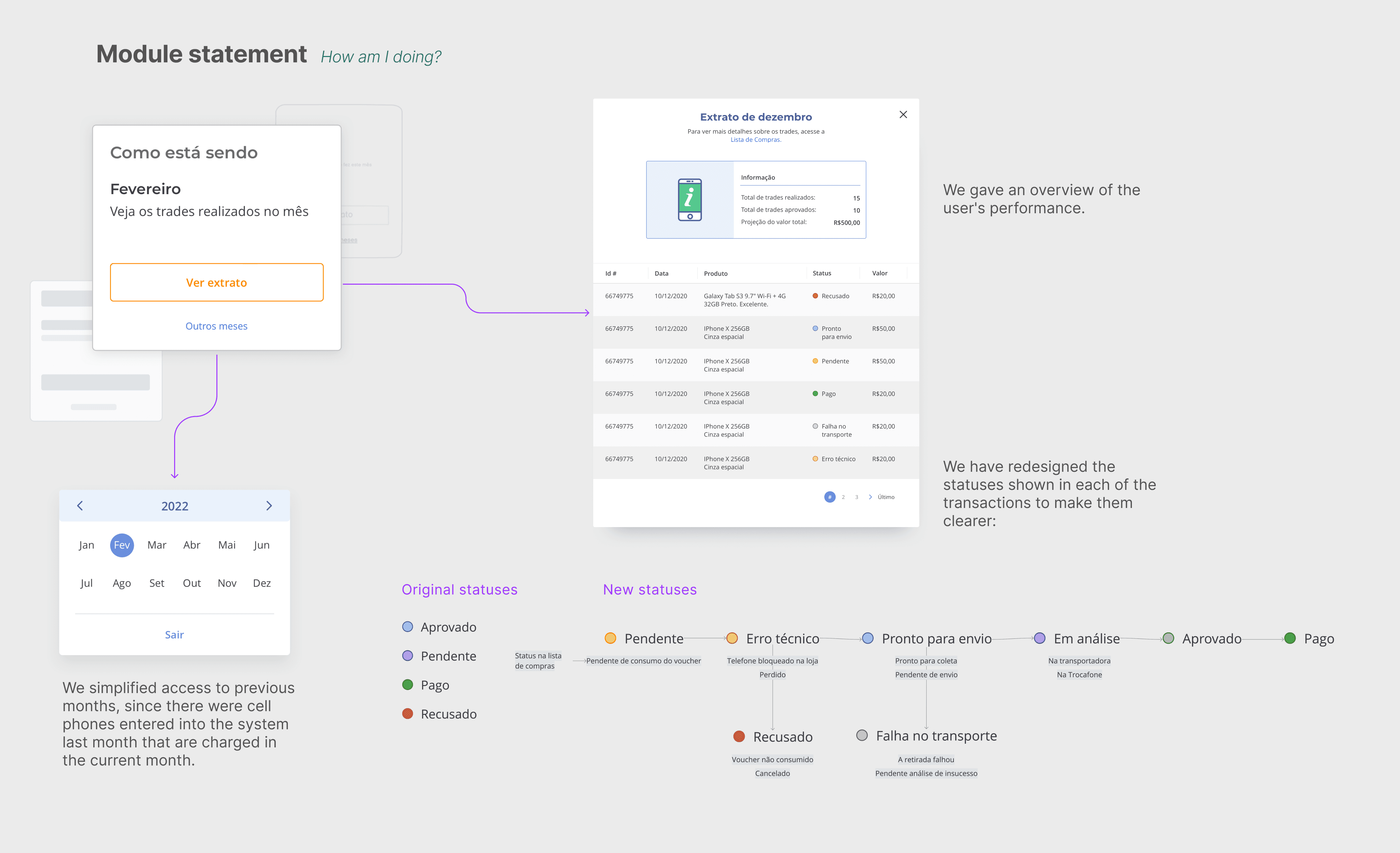
Sellers don't know when they will get paid.
Sellers don't know how much they will receive, as some devices are discarded in the middle of the process.
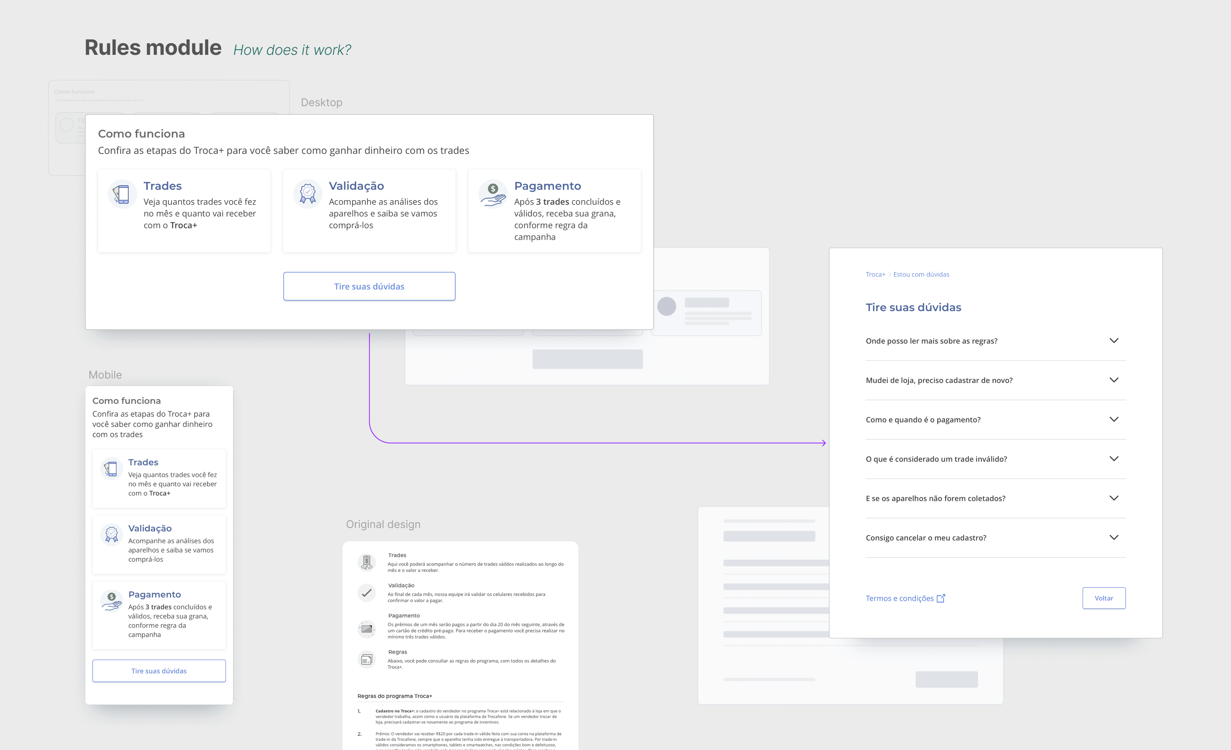
Program rules are confusing and many do not read them.
It is difficult to access the movements and the summary of the previous months.
What users are doing:
Users click on non-clickable areas.
Users check the status of the transaction several times.
Users generally access the summary of the last two months.
Once we had identified the opportunities for improvement, from the UX area we organized a workshop with the entire B2B squad, which included PMs and developers, as well as product stakeholders.
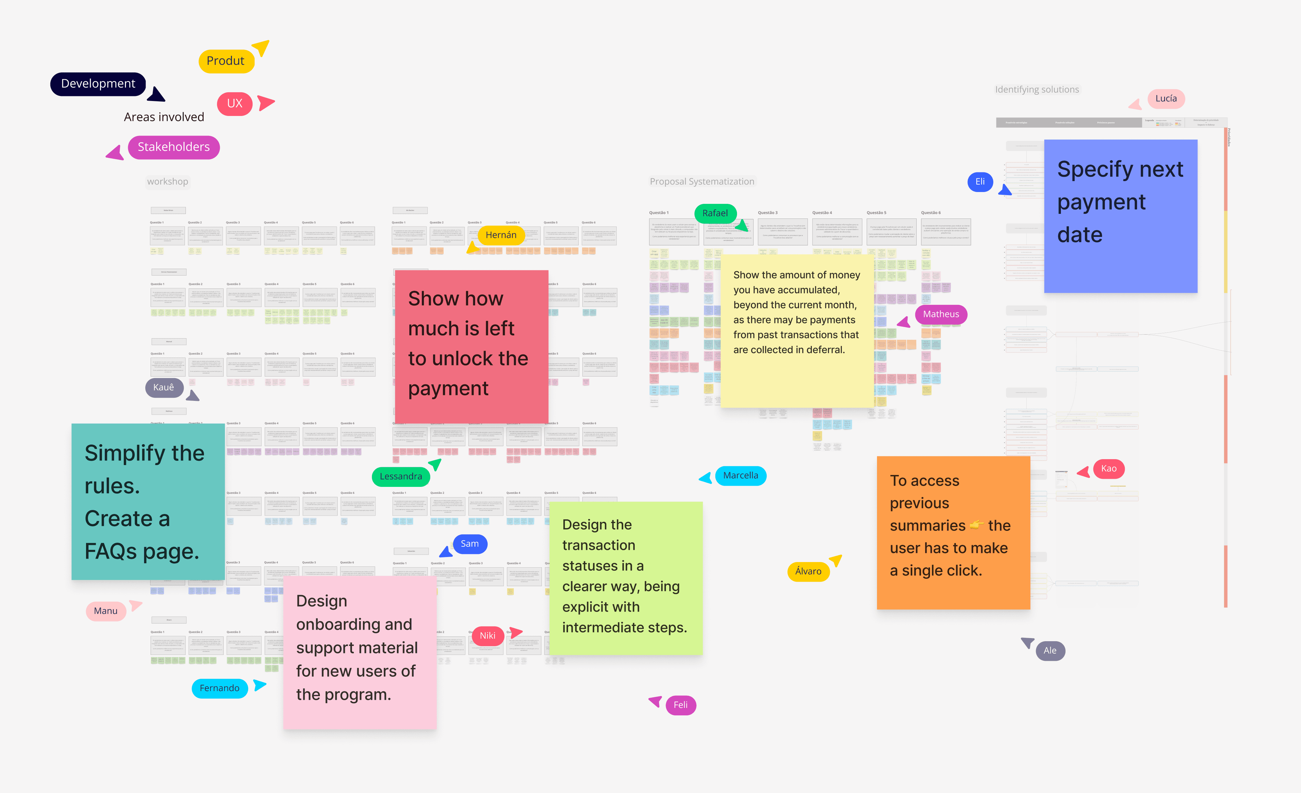
In order to speed up the delivery to development, we decided to think of the Troca+ program home page in a modular way. Each module would have a function and we would focus on prioritizing it in a clear way.
Result
Once we launched the changes to production, we went back to monitoring user behavior via quantitative surveys and screen recording.
The final impact of the changes in the first three months was an 18% increase in program membership and an overall increase in trades made by all Troca+ users.
See other projects: