Asset Garden

|

UI Design

Asset Garden

|

UI Design

Asset Garden

|

UI Design

Asset Garden

|

UI Design

An app for tracking your assets

An app for tracking your assets

An app for tracking your assets

An app for tracking your assets

My rol

AG

Lucía Sánchez Vilar

UI Designer

The team

MP

Mark Pors

Stakeholder & Developer

MP

Stan van de Burgt

UX Content Design

My rol

AG

Lucía Sánchez Vilar

UI Designer

The team

MP

Mark Pors

Stakeholder & Developer

MP

Stan van de Burgt

UX Content Design

My rol

AG

Lucía Sánchez Vilar

UI Designer

The team

MP

Mark Pors

Stakeholder & Developer

MP

Stan van de Burgt

UX Content Design

My rol

AG

Lucía Sánchez Vilar

UI Designer

The team

MP

Mark Pors

Stakeholder & Developer

MP

Stan van de Burgt

UX Content Design

Context

Context

This case study focuses on the redesign of Asset Garden, an app where you can upload your investments in different locations and centrally monitor their development. Asset Garden alerts you when a portfolio is out of balance according to what you set. The original version, released in MVP terms, can be found on Google Play and App Store.

This case study focuses on the redesign of Asset Garden, an app where you can upload your investments in different locations and centrally monitor their development. Asset Garden alerts you when a portfolio is out of balance according to what you set. The original version, released in MVP terms, can be found on Google Play and App Store.

Problem

Once the MVP is launched and proven usable, it is time for a redesign. The original design had a lot of room for improvement in terms of usability and interface.

How can we turn Asset Garden into a serious app, but also one that stands out in the sea of apps in the field?

How can we turn Asset Garden into a serious app, but also one that stands out in the sea of apps in the field?

How can we turn Asset Garden into a serious app, but also one that stands out in the sea of apps in the field?

How can we turn Asset Garden into a serious app, but also one that stands out in the sea of apps in the field?

Original MVP design

Solution
/ Design

Solution
/ Design

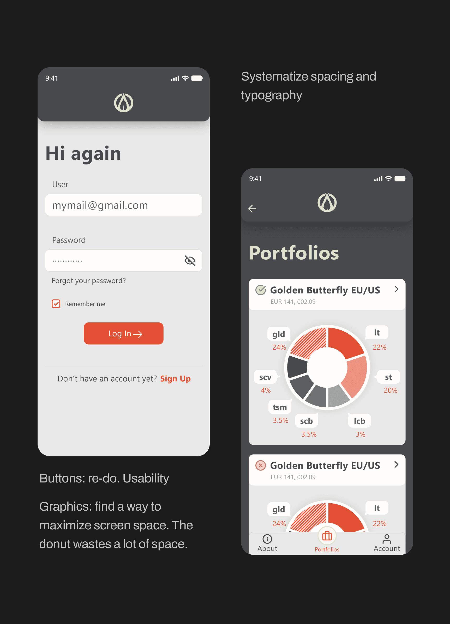
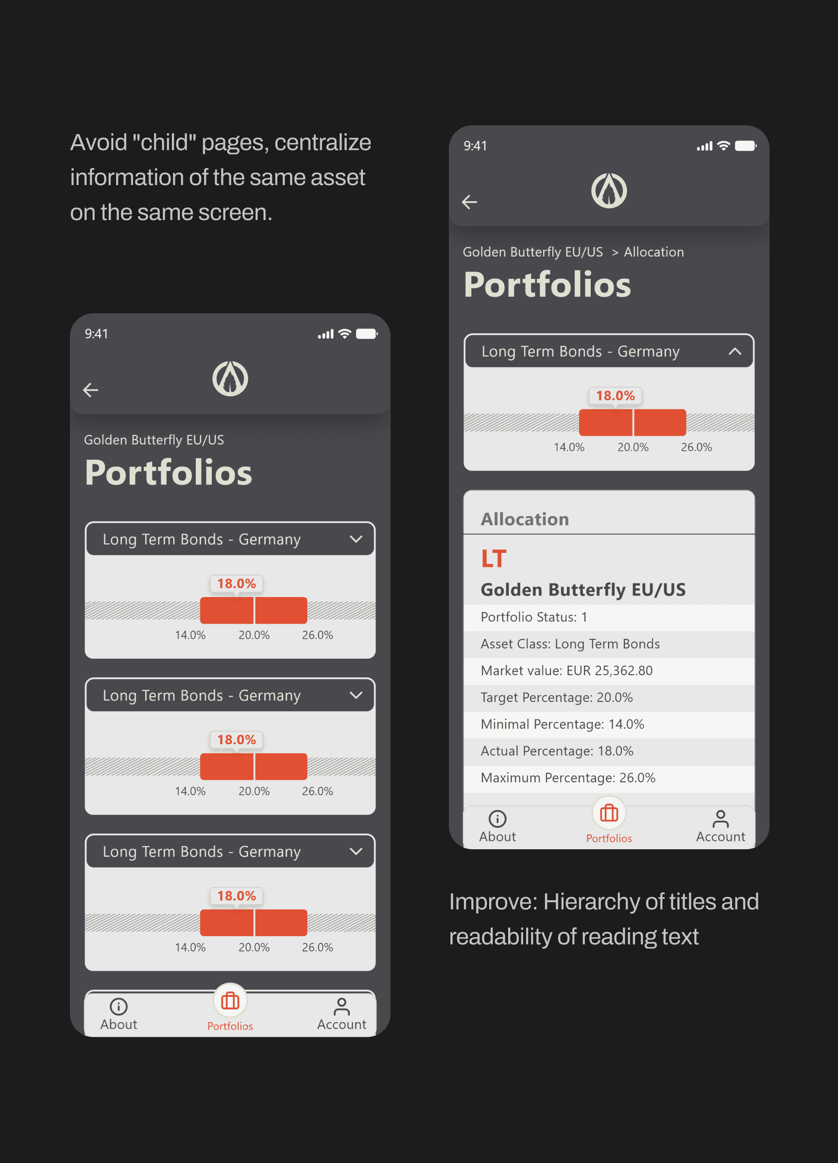
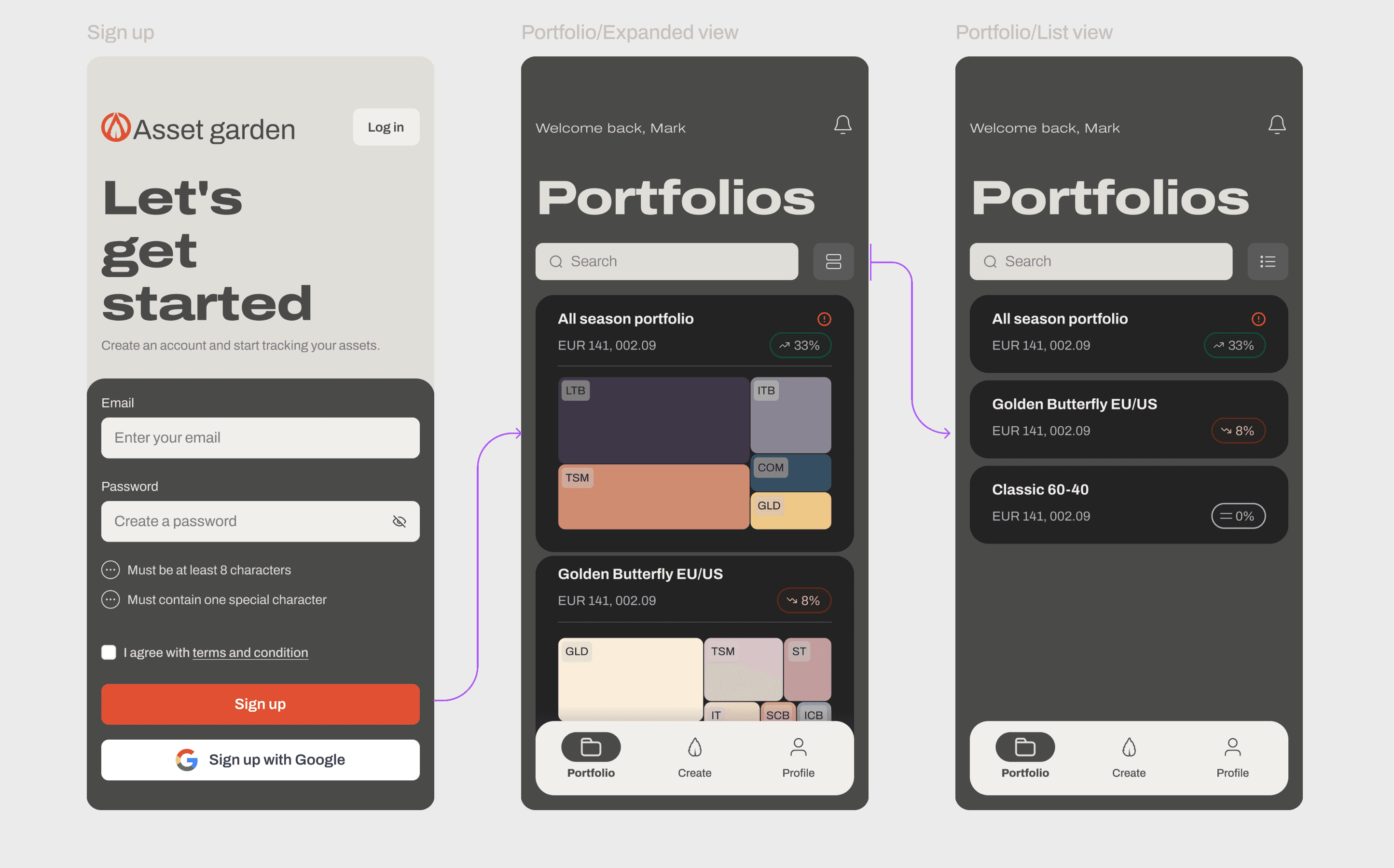
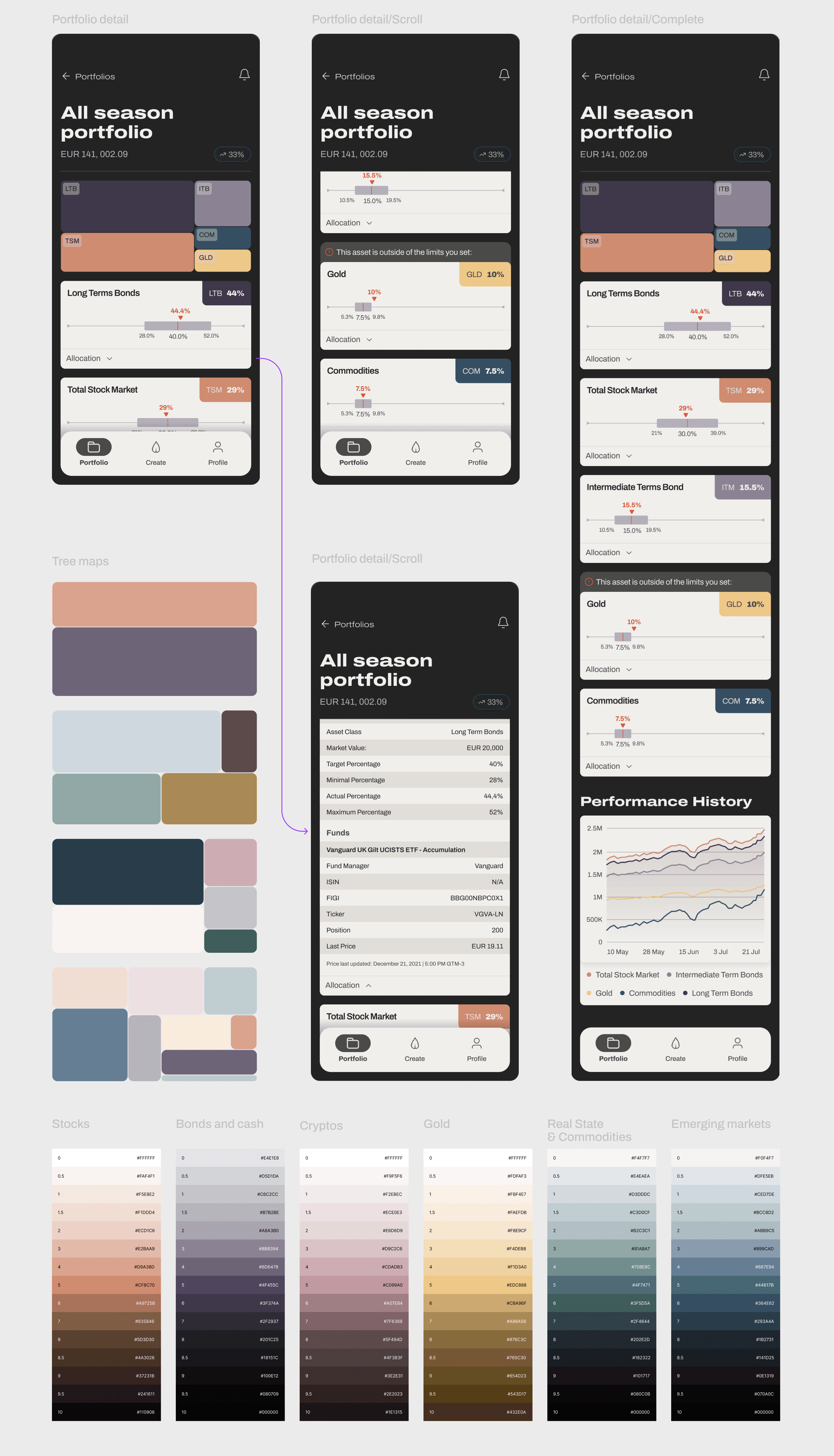
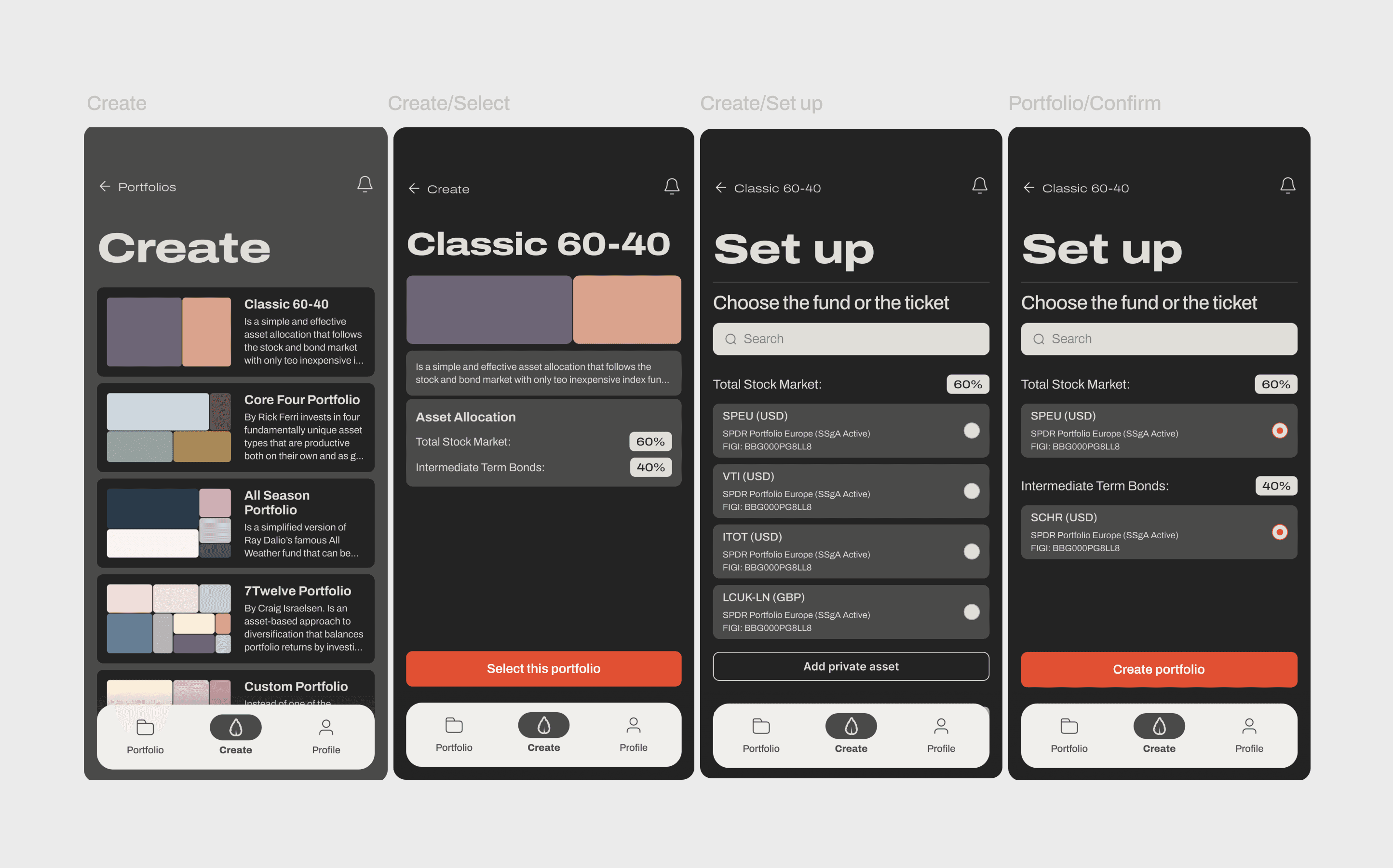
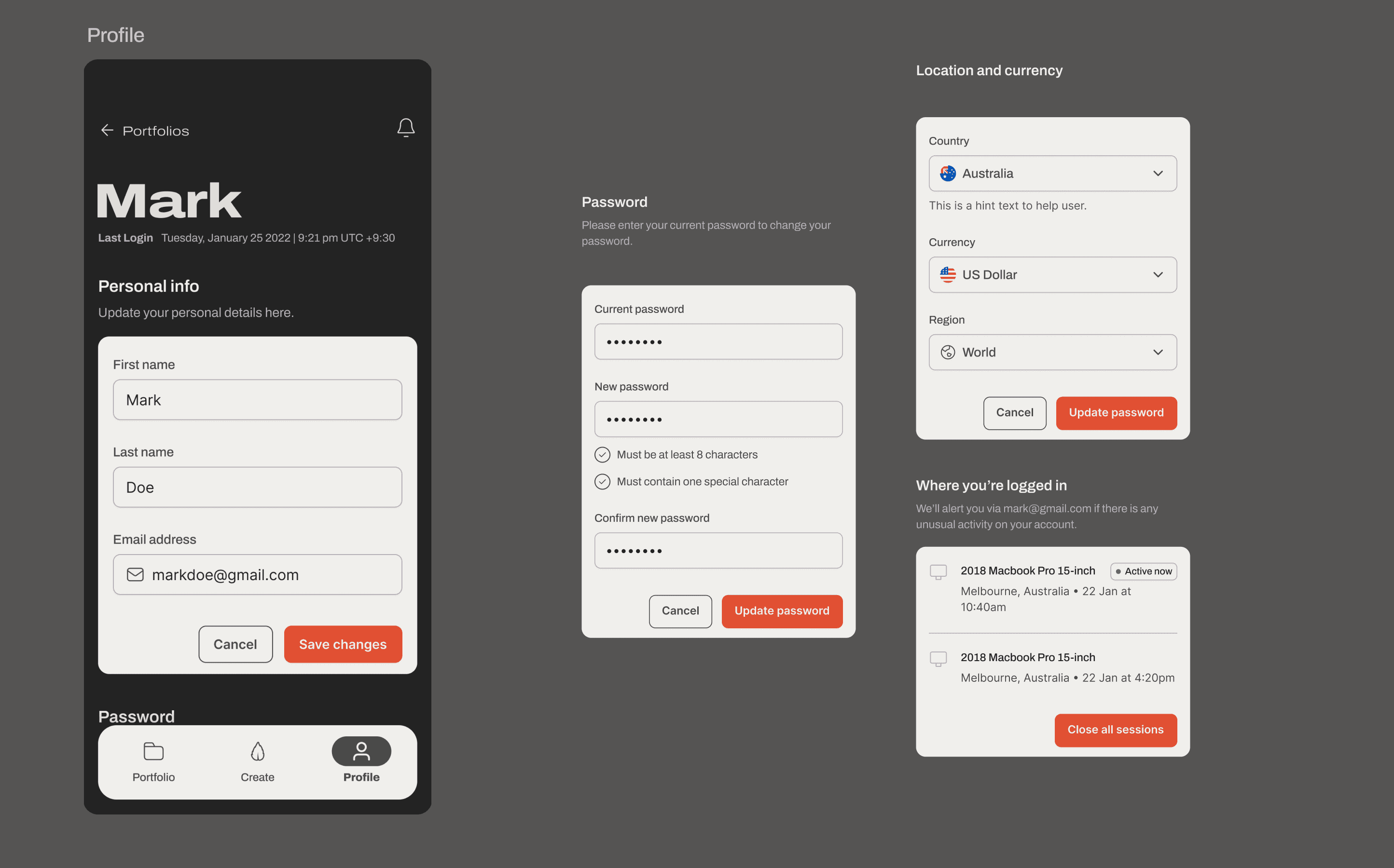
We decided to iterate the typography used to improve legibility, the color palette was further developed and finally, we defined other types of graphics that would not take up so much space.

In general terms, the UI wants to express a vintage touch, but also strong and impressive. The goal is to focus the user's attention on one element at a time, to avoid the cognitive load of so much technical information at once.